

Litmus Test Player: The Importance of Accessibility
Investigating and designing keyboard interactions for teachers and students using the Litmus test player.
Figma, Miro
Tools
Role
Associate Experience Designer
Overview
Litmus is an end-to-end test creation and delivery platform for lower-stakes, on-demand digital course and practice tests to be delivered via Cambridge One.
Problem
When Litmus was initially designed, accessibility was not considered, which meant that users with disabilities may have been navigating the test player with difficulty.
Solution
Investigate the current keyboard interactions and propose different keyboard interaction flows for each activity type.
Understanding the Litmus Test Player
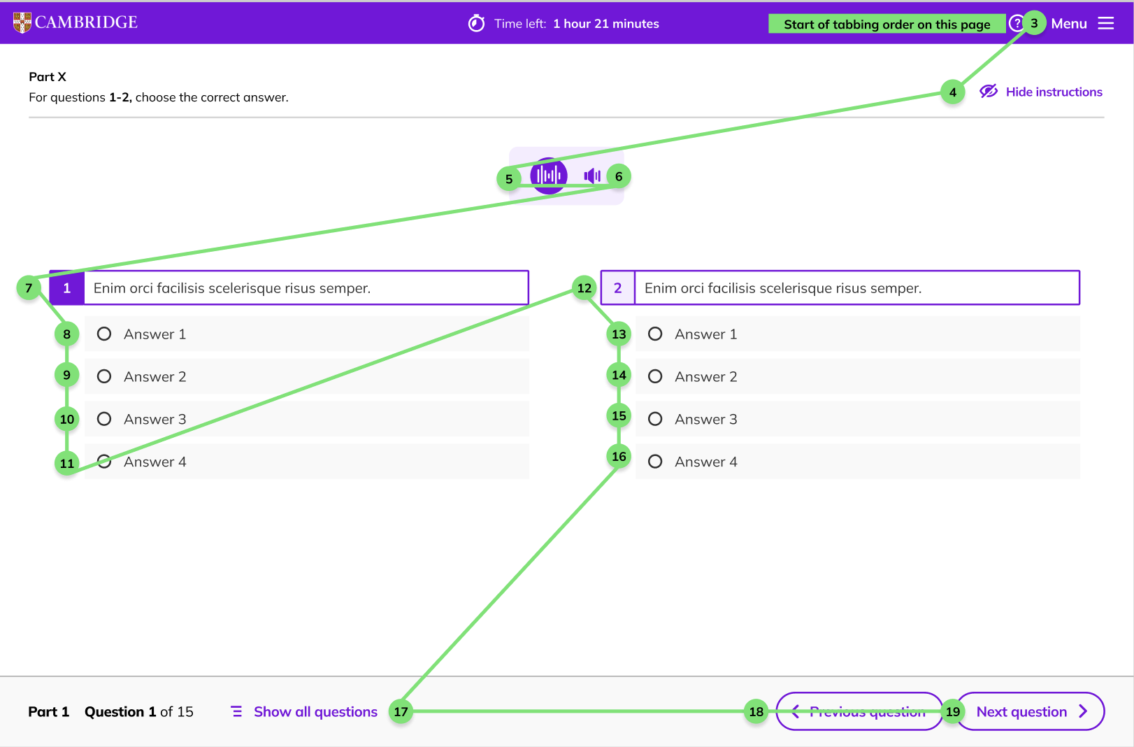
When I first joined the team as an Associate Experience Designer, I had to quickly learn the ropes of everything. One of my very first tasks, was to identify the current keyboard interaction journey for one of the activity type on the test player: Gap match.
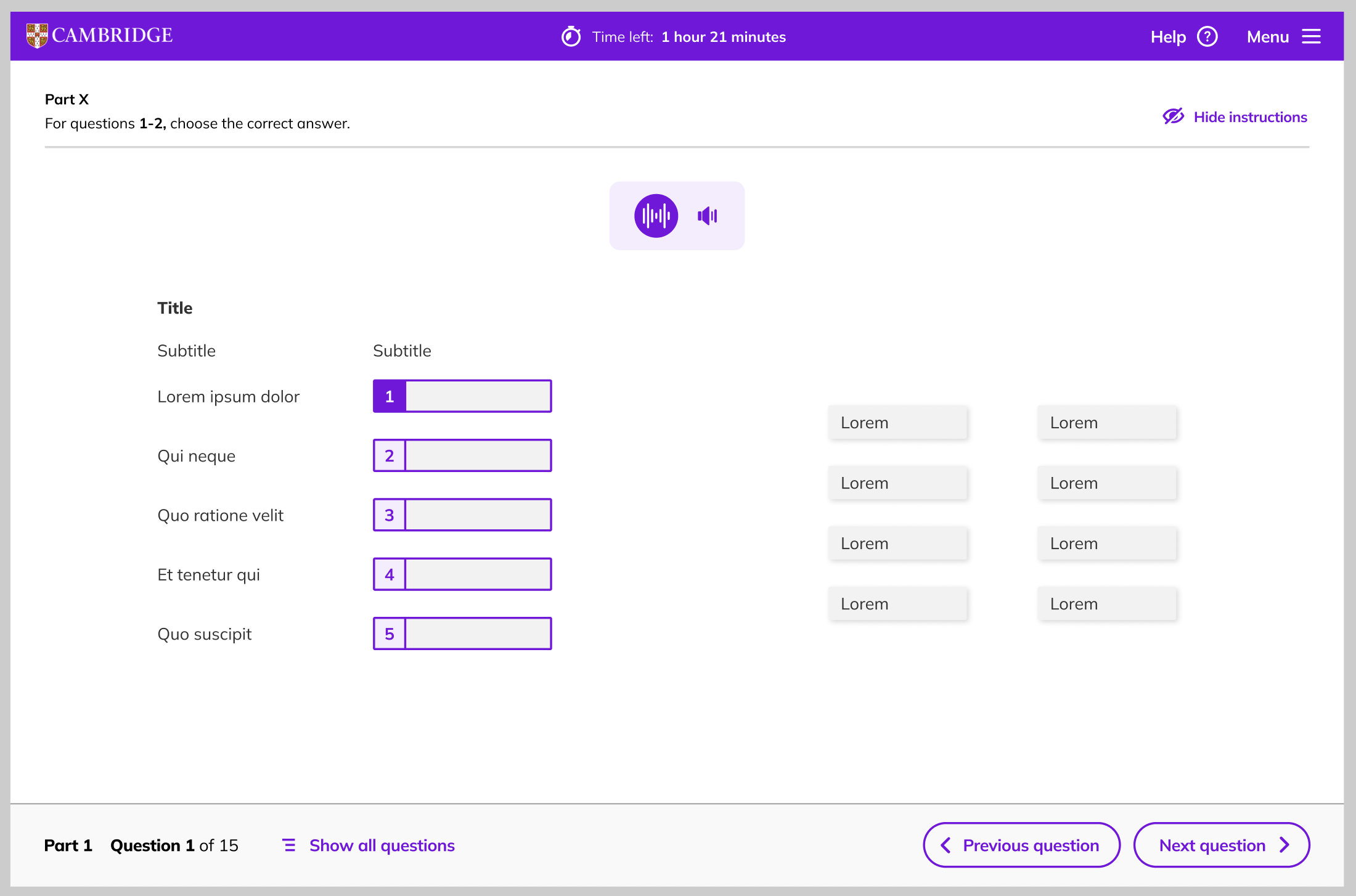
After doing some investigation, I noticed that many of the components seen on the test player (not just the gap match activity) were not focusable and made it very difficult to interact with the test player on keyboard. How were students, especially those who rely on the keyboard, supposed to navigate the test player? We also had to decide whether we wanted the gap match activity be a ‘tap-to-tap’ or a ‘drag and drop’ interaction. This was a huge concern, and something that we needed to prioritise as a team.
The Standard Way
The next thing that I did after was research the standard keyboard interaction for the gap match activity. I needed to figure out how the keyboard interaction flow was suppose to be, what other platforms were doing, and how we were going to incorporate it into our test player.
Duolingo
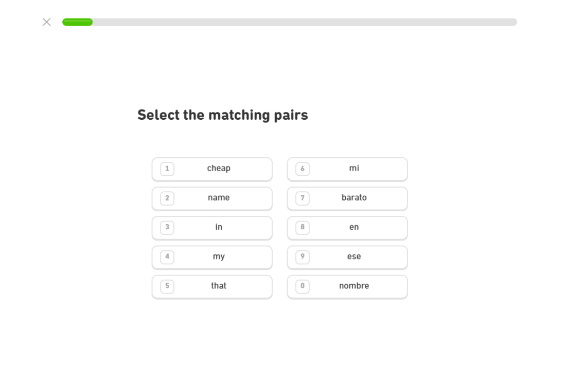
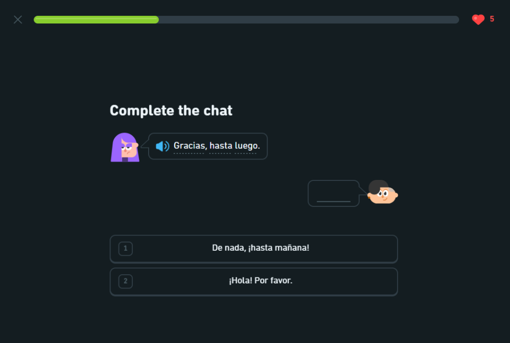
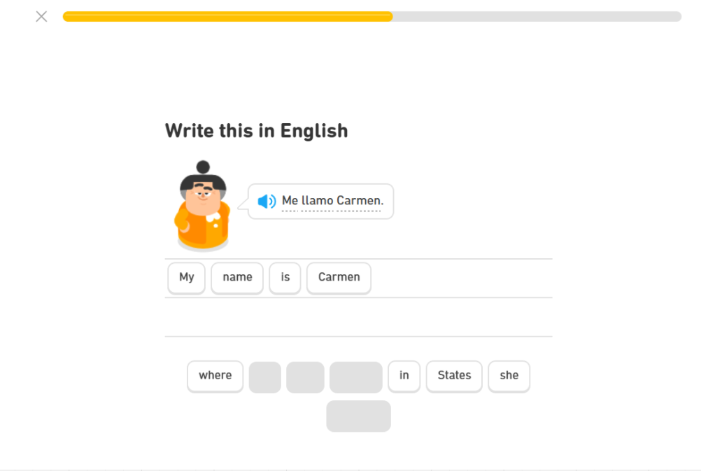
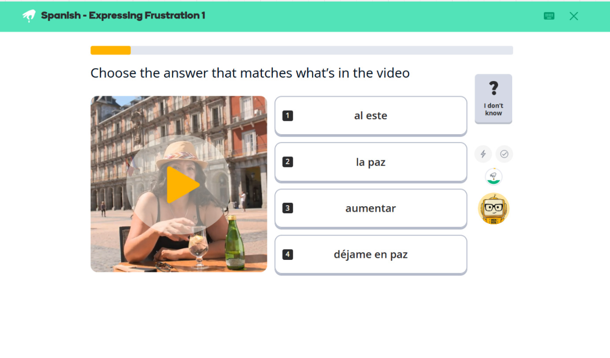
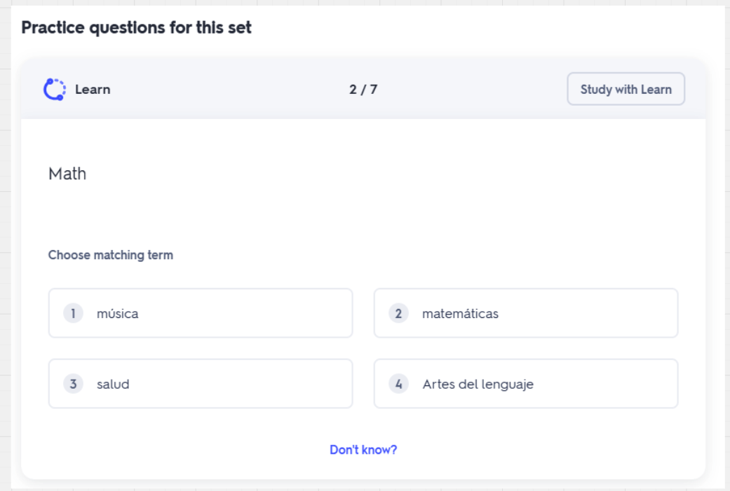
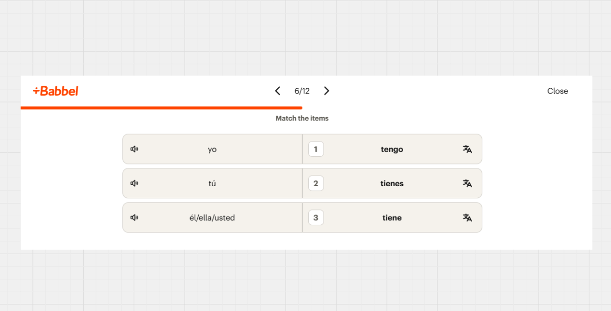
For some of Duolingo’s keyboard interactions, they use numbers to match tiles together or fill in the gaps. This makes it easy for their learners to pick an answer, as they do not have to press ‘tab’ on they keyboard to ‘activate’ the keyboard interaction, but instead just press the numbers. However, this is limited to only a few activities, and if the user wanted to remove any tiles, they would have to use their mouse. Similar keyboard interactions were seen in other platforms, such as Memrise, Babbel, and Quizlet. It’s also important to note that Duolingo uses both ‘tap-to-tap’ and ‘drag and drop’ interactions, however some other platforms were limited to only ‘tap-to-tap’ OR ‘drag and drop’.
Memrise
Quizlet
Babbel
“As with previous step I am able to select any of the four pictures at the bottom of the screen, but I am unable to drag and drop them into the box shown in the picture, resulting in me having to get help from somebody able to use a mouse in order to be able to drag and drop the relevant picture into the relevant space.
- Quote from a keyboard only user that was noted in our Digital Accessibility Centre (DAC) report for the whole Cambridge One platform
Coming Up With a Solution
Based on the competitive analysis, the Web Content Accessibility Guidelines (WCAG), and the Digital Accessibility Centre (DAC) report, I came up with 4 different solutions:
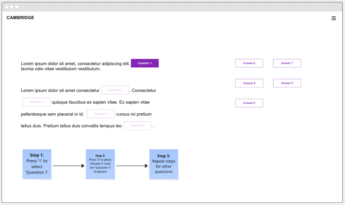
Option 1: Numbers to Numbers
Similarly to the other platforms mentioned before, Option 1 proposed having numbers match the question with the answer tile. Not only was this accessible, but it was also time efficient and easy to understand for all users. However, the biggest problem with this option was it did not really account to how many questions and numbers there could be on one page; limited numbers means limited tiles.
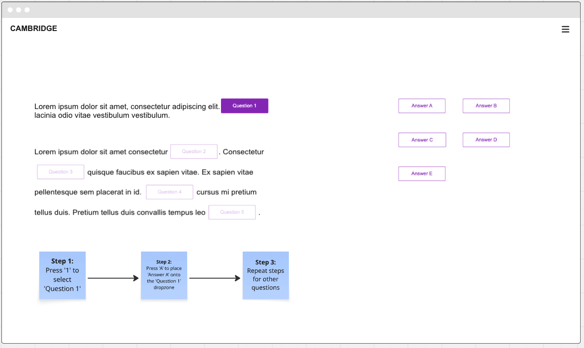
Option 2: Numbers to Letters
Instead of matching numbers to numbers, Option 2 focused on matching numbers to letters. Again, it’s both time efficient and accessible, and it’s not as limiting as the numbers to numbers option. However, the problem was this keyboard interaction is not common at Option 1 and users would be unfamiliar with this feature. Furthermore, there is a chance that finding the letter with the number the user wants on the keyboard may cause a slight delay, which isn’t always a good idea, especially in a test taking environment.
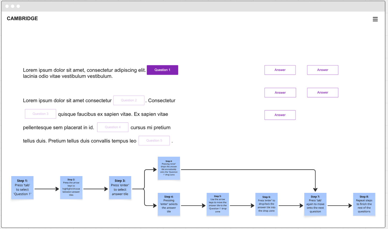
Option 3: Tab, Arrows, Enter
Option 3 follows the standard keyboard interaction where the user uses ‘tab’, ‘enter’, and the arrows on the keyboard. When first clicking ‘tab’, the user would be navigated to the first question, while at the same time, the user would use the arrows to pick an answer on the right. The user would then press ‘enter’ and the answer tile picked with the arrow keys would drop into the question gap. We assumed that this was easy to understand and the user wouldn’t have to press ‘tab’ on every single interactive component shown on the screen. However, the problem with this option was that having two components focused on at the same time was not a very common feature at all, making it not as accessible as we thought it’d be.
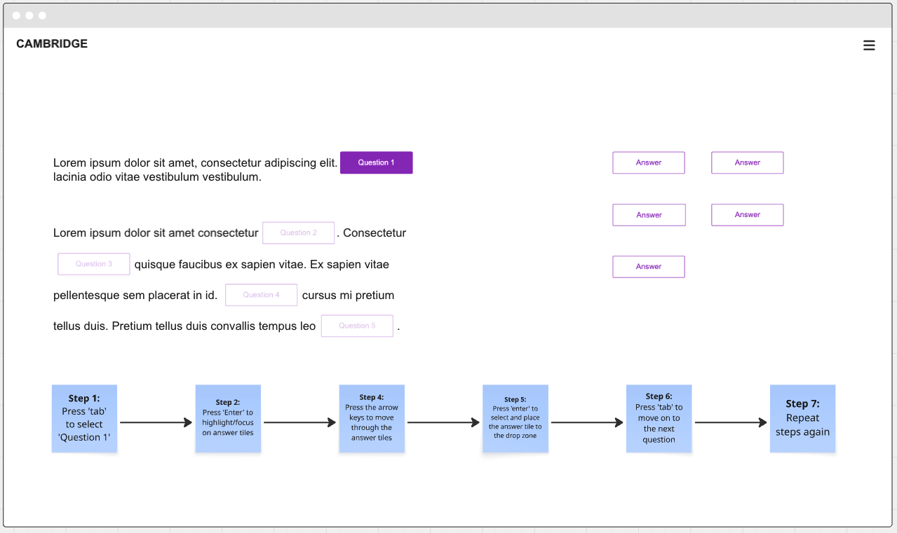
Option 4: Tab, Enter, Arrows
The last option followed the same keyboard interaction as Option 3, but as a different flow. When the user is focused on the first question, the user would press ‘enter’, which they would then ‘activate’ the answer tiles, and the focus state would switch from the question tile, to the answer tiles. The user would then use the arrow keys to pick an answer tile, which they would then press ‘enter’ on, and the answer tile would drop itself into the question tile. Not only was this option accessible, it was easy to understand, and it limited the need to keep tabbing on every single component to get to the chose question/answer tile.
And the Winner is…
After presenting this to the scrum team and the wider design team, it was decided that Option 4: Tab, Enter, Arrows was the best approach for the gap match keyboard interaction. The risk is not as big as the other options, and it is easy to understand, especially for keyboard only users. In addition, after talking with the devs, this felt like the easiest one to implement, as it followed the standard keyboard interaction of using ‘tab’, ‘enter’, and arrow keys.
Example of how Option 4: Tab, Enter, Arrows works on the test player
Only the beginning…
Defining the keyboard interaction for the gap match activity was a satisfying small win for the test player, however there’s still a lot of work to do for the whole test player in terms of accessibility. We had to define the keyboard interactions for every single activity type that was shown on the test player. This included:
Multiple choice
Inline choice
Text entry
Extended text entry
Table match
With the keyboard interactions, we also had to define the tabbing order for each activity, and design a focus state that passed the colour contrast checker. Since accessibility was not defined at the beginning of this project, our accessibility work does not stop there, and our next steps for this test player is focused around screen reader work and defining aria-labels for each interactive component, and defining HTML regions.
Closing Thoughts
Since joining the Litmus team, I enjoyed researching and exploring all about accessibility. It has helped me understand what accessibility and inclusive design means, and reinforced the importance of considering these principles from the very beginning of the design process. By doing so not only supports users more effectively, but it also makes implementation smoother for both designers and developers. I also learned that prioritising accessibility early on benefits the business by reducing the need for extensive rework, ongoing improvements, and maintenance later in the process.
My Other Works
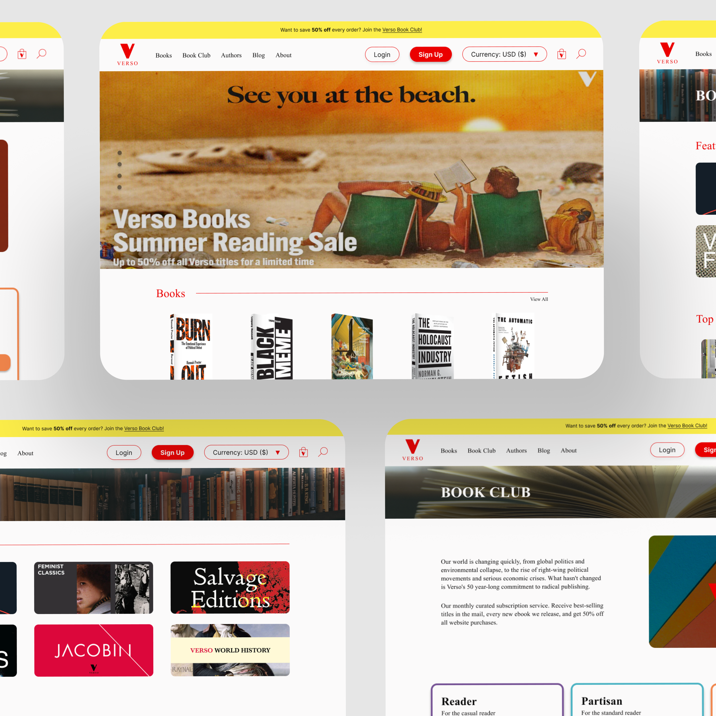
A Journey of Functionality and Visual Design
Redesigning Verso Books’ website to be more user-friendly and functional.
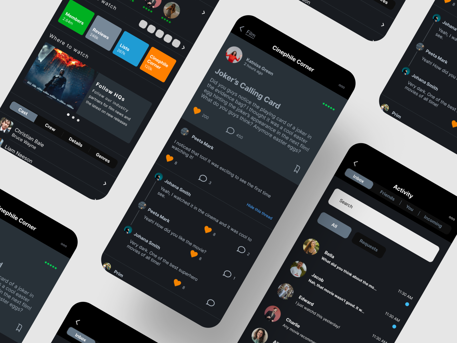
Bringing Movie Lovers Together
Expanding Letterboxd’s reputation by adding a forum feature and a chat DM feature.

Uncovering the Philippines’ Rich Culture
Designing an end-to-end travel app that specifically highlights the rich culture and attractions of the Philippines.